Principles
The NUEL’s design is geometric, sharp, and flat. It uses basic shapes and colors to create clearly NUEL-labeled assets. Fonts are sans-serif, light, and high contrast, ensuring elegant content stay readable.
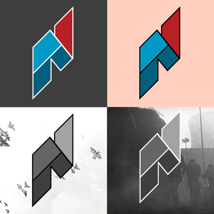
Logomarks tend to be vertical and accompanied by text. This ensures the branding space is flexible for a wide variety of formats and collaborations without losing its look and feel.
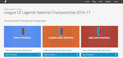
The website uses a light, card-based user interface to clearly organize diverse offerings and delineate complex tournament information. Color is used to differentiate cards and as a consistent blue CTA.
General Use
The NUEL has built a signifcant amount of respect within university esports in the UK and abroad. The brand both perpetuates and influences this respect. Clean, consistent designs will reinforce the idea that the NUEL is a premier organization. Messy designs with little quality or content control leaves parties disappointed and uncertain, associating the NUEL with bad content or events. When in doubt, use provided templates, stick to the principles, and let “less is more” guide decision-making.
Resources
NUEL assets and branding are not to be recreated, distorted, edited, or used in inappropriate contexts. This design guideline should be read—at least skimmed in its entirety—before using any of these assets. Use common sense. Respect the brand.


